⚡ Only 300 spots remaining • Closes in 2d 14h 32m
⚡ Only 300 spots remaining • Closes in 2d 14h 32m
A professional "Consumer Fintech" dashboard. Focuses on "Transparency" and "Ease of use" through simple progress bars, transaction lists, and a calm palette.
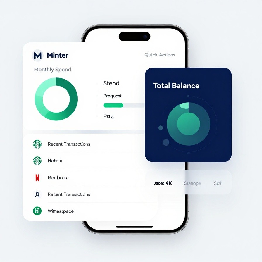
UI/UX dashboard design for a {type: modern personal finance app} called {name: "Minter"}.

Visuals:
- {charts: A clean "Monthly Spend" donut chart and a savings "Progress Bar"}
- {list: A scrolling list of "Recent Transactions" with small merchant icons (Starbucks, Netflix)}
- {card: A large "Total Balance" card in {color: Deep Navy} with glossy glass-morphism effects}
- {style: Minimalist, clean, and trustworthy with lots of "Whitespace"}

Layout:
- {screen: A balanced mobile home-screen with "Quick Actions" (Send, Request, Pay)}
- {typography: A friendly and highly readable sans-serif like "Inter" or "Manrope"}
- {palette: Navy Blue, Emerald Green (Savings), and Soft Grey}

Technical:
- {resolution: 4k sharp UI render}
- {atmosphere: Safe, organized, helpful, and empowering}

Style: {aesthetic: Mint / Revolut / Monzo style, modern-fintech}Join IMGlory Premium and unlock our complete library of professional Nano Banana Pro prompts, plus access to AI tools and marketing resources.
Get Full Access